By Jamie: So! I did a run cycle and Jed wants you to know how it’s done.
But first, the thrilling backstory! Jim Spaceborn hails from a Lego comic book from the 80’s that remains largely forgotten among today’s young fans. Two adventures were published, the first of which has pride of place on my shelf, and a third was almost ready to go when Lego Publishing was shut down in 1987, boo. A few mini-books were written, but most interesting to me, there was talk of an animated feature film, a videogame, a cartoon series! Only storyboards for the first ten minutes were ever produced, and 80’s Lego space-guys would remain fairly low-key until a certain blue one with a broken helmet bounded onscreen and helped save the whole plastic world from being permanently glued together. The sequel to that thrilling, if a little hectic, adventure is coming in 2017! It’s set to be… dystopian.
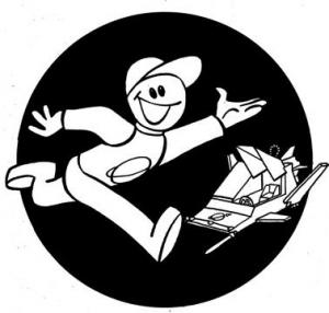
Looking for a decent bit of practice to keep myself entertained on a productive level, this was a drawing too full of life to resist. Though it bears no signature, we can comfortably assume this drawing is from Frank Bruun Madsen, the only credited illustrator of Jim Spaceborn, although it’s possible art director Ole Kaarsberg drew things too. The arrangement is oddly familiar.
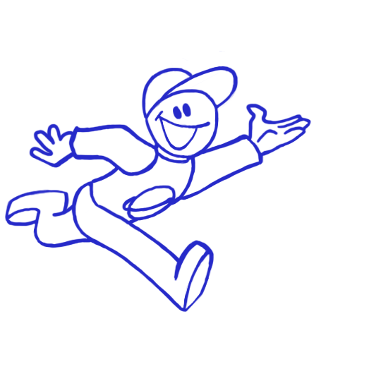
Wanting to be as true to the original as I could, I opened the drawing in photoshop, scaled it up a little, drew a big black circle in the exact middle of the document, and, using blue so as to make the lines show up, I traced Jim on a separate layer. Then I copied the tracing for the opposing frame in the cycle. I redrew the hip area so the legs appeared to swap positions, and I redrew his arm to be forward. I wanted the other arm to stay outstretched so he can wave at us as he runs.

I then tried to work out the between positions for that nearside arm. I copied the bits that weren’t set to move much, and initially started with ten frames, working on twos (that is, each frame holding for two of the 25 frames per second, lasting a total 0.08 seconds. Photoshop prefers to work in such obtuse formats as decimal points of a second and I can’t fathom why). The motion came out very smooth. But smooth as it is, he doesn’t appear to be moving very fast.

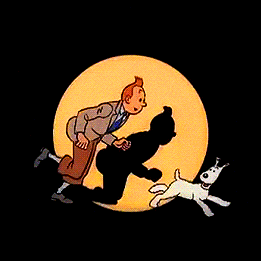
I looked again at Tintin’s run. It seemed to me I was looking at six frames running on threes (0.12 seconds each) and far closer to a limited frame style which I wanted to practice. According to the Animator’s Survival Kit, this is half the number of frames typically used in a standard run! Perhaps Tintin is running on fours? I chose to keep the positions closest to the two positions derived from the original, as it would give me a cheap ease-in / ease-out and snap effect between strides.
Knowing I’d saved myself some work, I went on to complete the legs for the cycle. I was still reusing the same head and arm drawing but adjusting the position. Typical run cycle vocabulary fails me here. The down position and passing position are the same frame, and I’m not sure what to call a frame with both feet in the air, but that’s the up position too. So. I had the rough version.

When I was cleaning up my rough drawings, I decided to adjust the leg positions a little so the alternating strides had more variation between them, for one stride, he has an arm outstretched rather than helping him to push forwards, so it makes sense that that stride should fall slightly flat. I also wanted to do some squash and stretch on the head somehow, as the lack of animation in that area was initially somewhat jarring. My experiments in reworking his face on the down position came up a little weird, so I decided to focus on making the hat bounce. I remembered the advice given to Disney animators. Push it to the extreme. Push it twice as far as you expect will work, push it so far you expect to be fired. Well, I don’t even really have a job right now, so this was going to take some doing. I drew the hat brim twice as big as it would be, and I found the resulting bounce satisfactory, which goes to show how far you can push something and it still seems normal.
All that was left was the colouring. I pulled the colours from model sheets and saved swatches, and then I threw out some of the colours because they looked weird. That’s the trouble with model sheets coloured on paper. It was at this point I changed the saturation on the lines to turn them black, as the blue had outlived its usefulness. I used the polygonal lasso tool to follow the lines, and filled in the different areas on separate layers, put them in folders assigned to their frames, general housekeeping stuff fairly long and boring but important.

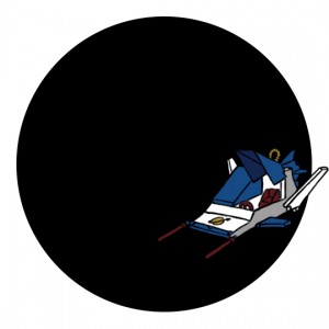
With the logo I had turned one line into three, so that I could include the red stripe and rocket pattern. The really interesting bit was the freckles (lots of copy and paste, rotating to keep them looking consistent, frankly I’m amazed it worked) the shading on the hands and body (lasso tool again, this time to keep my soft-edged brush from spilling out over the sides, to be honest I thought it wasn’t soft enough so I ended up doing a gaussian blur and cleaning the edges with the eraser tool) and the gradient on the head. Which was a little tricky because Adobe doesn’t make it very obvious how to play with the gradient settings. But once I found it, I managed to create a new three-tone preset, for the highlight/mid-tone/shadow effect found on most drawings of Jim. I also traced the little spaceship in the background. It doesn’t match up to any particular Lego set I can think of, so I had to invent the colour scheme based on the ones in the books.

I watched it though for a while and tweaked the lines a little more, mostly the face, which needed more cleanup for consistent line thickness, the legs looked a little weird.